
How To Read Forex Charts For Beginners
What Is a Forex Chart?
A forex chart visually displays price movements of a currency pair over time. Charts allow traders to study historical price behavior and anticipate possible future movements.
A forex chart is a visual "history book" of a currency pair’s value. It plots the exchange rate against time, allowing you to see exactly where the price has been and where it might be headed.
Before diving into the visuals, it is helpful to understand the underlying forces driving these price shifts. If you need a refresher, revisit our earlier guide on Why Forex Markets Move to see how economic data translates into these chart patterns.
Main Types of Forex Charts
The 3 Essential Chart Types
While most professional platforms offer various ways to viewdata, beginners usually focus on these three:
- Line Charts: The simplest view. It connects closing prices over a set period, providing a "big picture" look at the market's direction without the noise of daily fluctuations. This is usually the best for beginners.
- Bar Charts (OHLC): These provide more detail by showing the Open, High, Low, and Close prices for a specific period. The "ticks" on the sides of the vertical bar tell you where the price started and ended.
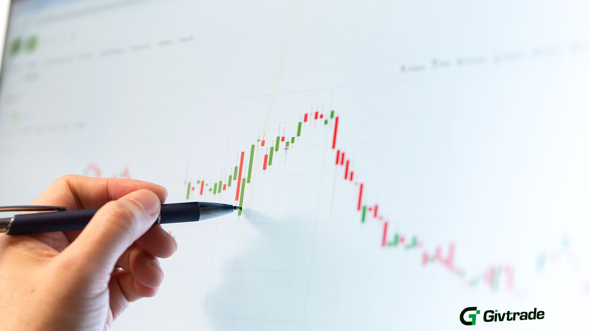
- Candlestick Charts: The gold standard and most popular trading chart for modern traders. These offer a 3D-style look at market sentiment
Green (Bullish) Candle: Buyers are in control; the price closed higher than it opened
Red (Bearish) Candle: Sellers are dominant; the price closed lower than it opened
Understanding Timeframes
Charts can be viewed across different timeframes such as minutes, hours, or days. Short timeframes show quick price changes, while longer ones reveal broader trends. Once you can read the candles, you need to identify the "flow" of the market. Trading with GivTrade’s advanced charting tools makes it easier to spot these three phases:
- Uptrend: Characterized by "Higher Highs" and "Higher Lows." The bulls are in charge.
- Downtrend: A series of "Lower Highs" and "Lower Lows." The bears are pushing prices down.
- Sideways (Ranging): The price is bouncing between a floor and a ceiling, showing indecision in the market.
Trading With Better Chart Insights
Learning and reading charts is a skill that improves with "screen time." By learning to interpret these visual cues, you move away from emotional "hunches" and toward a structured, professional approach.
Ready to put these skills to the test? The GivTrade platform offers a seamless, intuitive charting experience designed to help beginners transition from learners to active market participants. Start small, observe the patterns, and let the charts tell you the story of the market.


